Flats or Spikes: Video Review
This project lasted approximately 1 month from concept to final implementation in the Fall of 2021.
World-class distance runners strive to maintain the same pace throughout the event so its critical that runners know their split pacing. Coaches need access this data so they can provide the right guidance to help athletes continually improve. Some runners rely on fitness trackers to get split times, but this data is not shared across a team and not everyone has a smartwatch (especially middle and high school students).
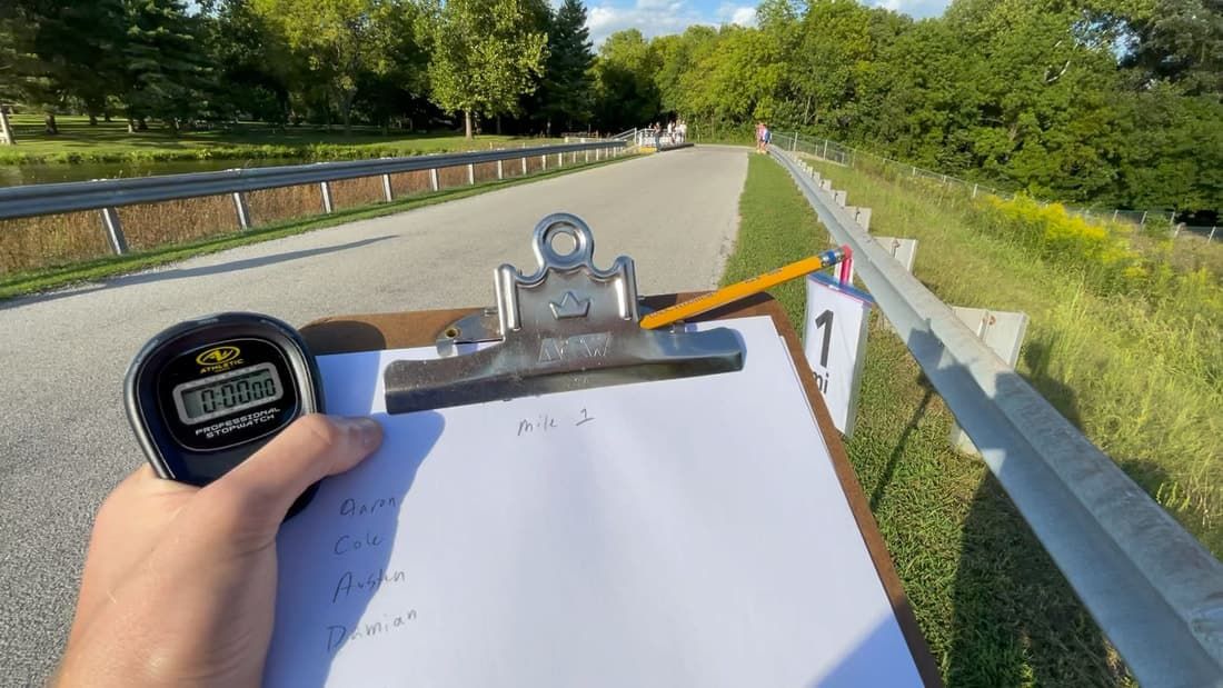
Cross-country teams currently solve this problem by sending parents, associates, and other athletes to each mile marker with pen and paper to capture times as each athlete passes by. Then a coach enters all those times into a spreadsheet to create charts that show how an athlete’s pace differs mile-to-mile. It might take a few hours or days for the coach to give feedback to their athletes. Everyone on the team really want that feedback immediately after crossing the finish line, as that is when the performance is fresh in your memory.
Flats or Spikes created the Team & Timing app to replace the paper and provide instant charts for athletes across the team, letting coaches provide feedback to athletes immediately after the race.
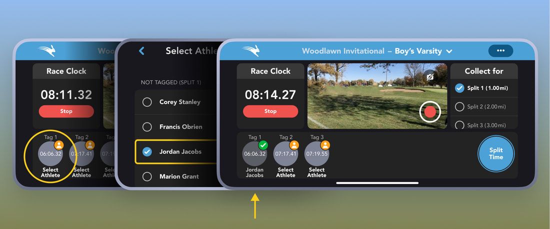
The app has a capture screen which lets someone at the starting line begin the race. From there, each split collector has a shared race clock and can tap a button to capture when someone runs by the mile marker. They can then assign a person to that time. This two step process optimizes for capturing accurate times and handles a number of scenarios such as: a group of 3 athletes run by at the same time. You can quick capture 3 times accurately, then assign a name to the times when you have a moment.
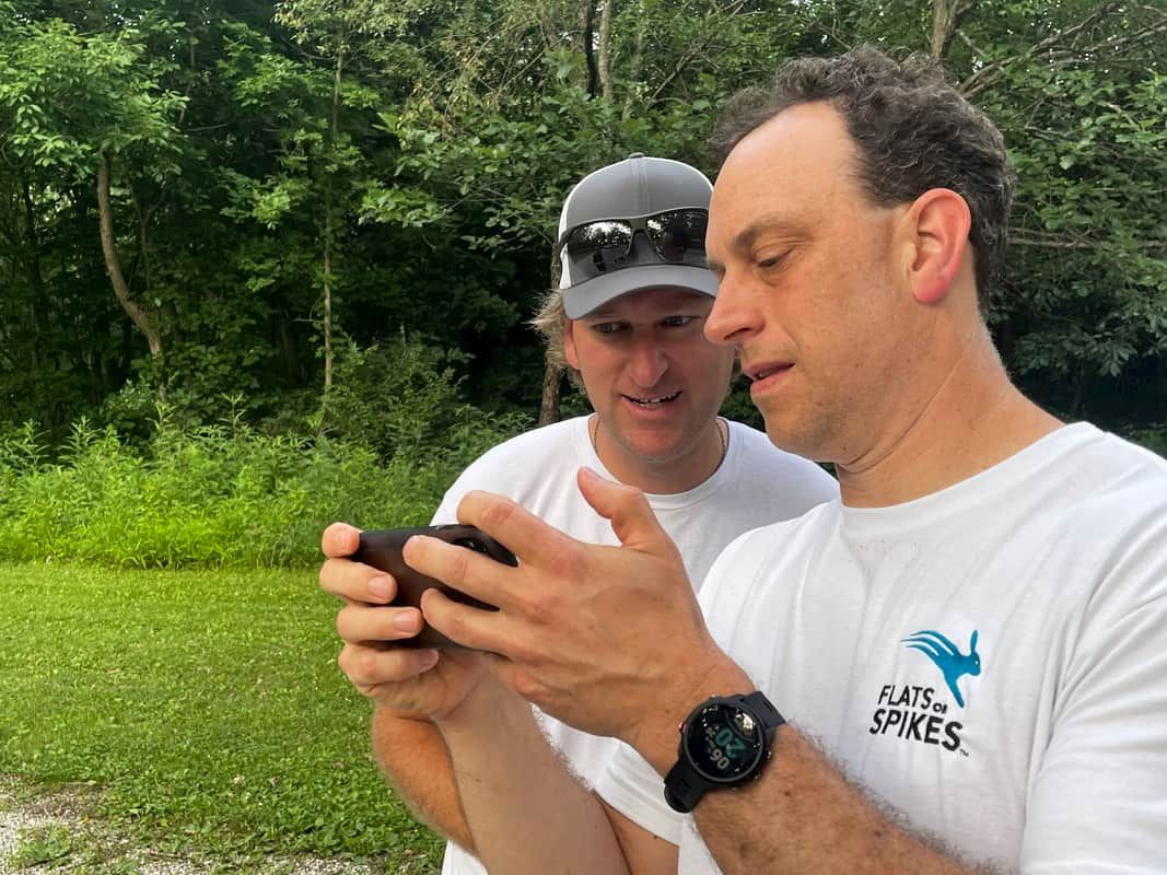
As we tested the app at a cross country practice, we discovered this system doesn’t work if the collector doesn’t know the athletes. How would you assign an athlete to a time if you can’t recognize them? Initially we thought this was an anomaly, since our development team had never met the cross-country team before. We validated this was an actual problem by talking to a coach. We knew coaches rely on a number of people to collect times for them. What surprised us was how often those helpers don’t know the team. For example: a parent may only know a few kids on the team, or maybe the men’s team is helping collect times for the women’s race. These might be large teams and they may not know each other!
Urgency
It was critical for us to release the app before the cross-country season started, so the initial release did not have a solution to this problem. Shortly after release we started receiving emails from customers asking for a solution, which further validated this problem and urged the team to prioritize this feature and create a solution quickly. It was a critical feature and we wanted to demonstrate we could respond to our paying customers in a reasonable timeframe. We set a goal to ship something in a 2-week sprint.
Inspiration
Knowing the core feature set of creating missing tags, moving tags, and assigning existing tags, I started by sketching out some ideas on paper and looking for inspiration. I knew the person at the mile marker could capture several short-clips, recording only when an athlete passed by.
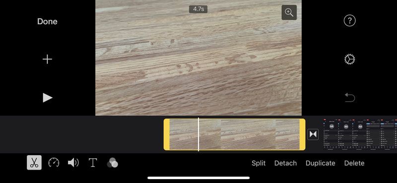
This lead me to explore timeline-based interfaces and I was inspired by iMovie and a few other apps with complex editors. I did a deep-dive into how these apps worked and built upon these ideas.
Concepts
Over a couple days I created a bunch of prototypes and designs. Using prototyping early in the design process helped give me a sense of how the final product would feel. Throughout these iterations, I did some light research looking for ReactNative libraries that could help us implement quickly once we had a design locked down.
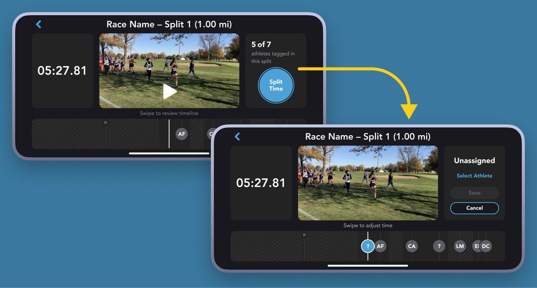
After several passes of refining the design and honing in on a few details (such as indicating portions of the timeline without video) I felt like things were in a good spot. You could scrub the timeline and the video would move with it, letting you see exactly when an athlete hit the mile marker.
Once I had some prototypes I met with the team to get feedback on the look and feel and technical feasibility. The team included product, quality assurance, frontend, and backend engineers. With a deadline of a single 2-week sprint, we all agreed to go ahead with this design and engineering started building it.
Snags
Once we started implementing the single timeline design we encountered a number of issues. For example:
- How do you define the start and end of the timeline? (The user could have created tags after or before the last video ended.)
- What was an appropriate scale for the timeline?
- Could we get pinch to zoom working on the timeline so you can improve your precision?
- How would it handle multiple tags created at nearly the same time?
We also found a litany of performance issues on low-end Android devices, which had trouble providing a smooth experience.
While none of these issues on their own were insurmountable, we were on a tight timeline and these issues were piling up. Many of these complications only came to light as we started using early builds.
Iterations
We decided to start with a much simpler solution and work our way towards the ideal design. Within a day or so I turned around a new set of designs, where each design inched closer to the final design.
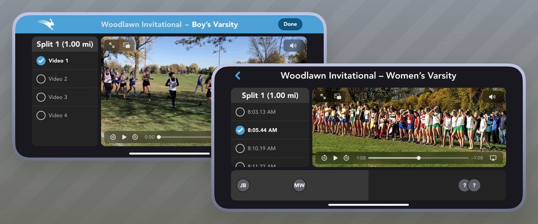
The first release let users playback your clips, but it didn’t let you adjust any of the time tags. This was a massive improvement over the current workaround which involved hopping back and forth between our app and the Photos app.
The next release built on this by showing a timeline. This iteration let you assign an athlete to a time tag but it had a disjointed experience where you had to scrub the video using native controls on the video and the timeline simply "filled in" to indicate its position in the video. You also couldn’t reposition a tag to improve its accuracy or create new tags.
Tradeoffs
I was initially hesitant about creating and shipping these intermediary versions of the feature, but by doing so we were able to deliver value to our customers incrementally during the most critical season for the app. It also allowed us to gradually tackle smaller usability and technical issues and build towards the ideal, polished design.
We showed a few coaches these initial versions and they were super excited by what this would let them do. This affirmed that even these half-step designs were useful. Sometimes when you’re designing something you miss the forest for the trees. I only saw what these designs didn’t do and our customers saw how it would make their jobs easier.
Results
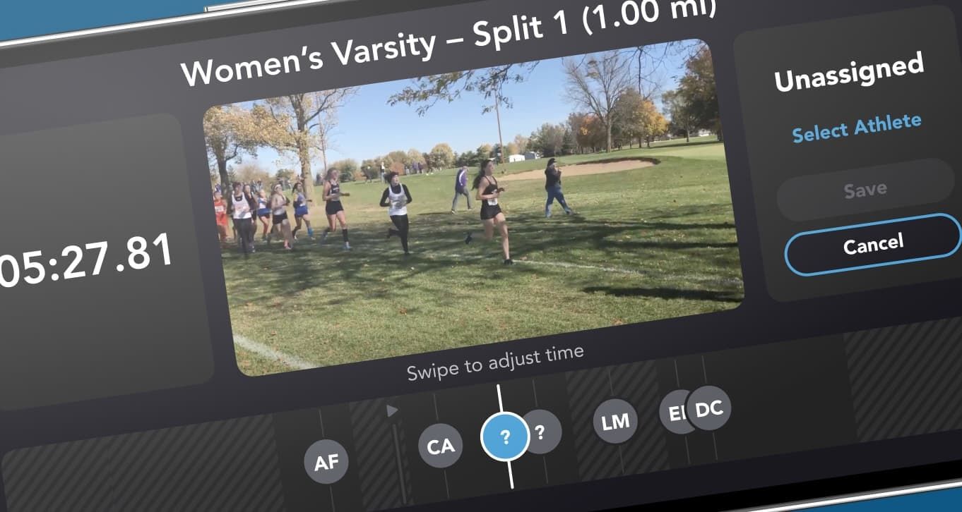
After several iterations we had the full timeline design implemented with all the capabilities our customers were asking for. You could scrub through the timeline and see who passed by and assign the correct athlete, or move the timestamp a few seconds to sync when they actually crossed the mile marker.
The result was building trust with our customers by proving we could respond to feedback, build something with great quality, and continually improve the app. Instead of getting feature requests from customers, we started getting emails thanking us for this feature.
We also learned the value of shipping incrementally and to not hold on too tightly to an “ideal” design. We listened to our customers, made tradeoffs, and brought a valuable feature to life. The result was a feature the whole team was proud of.