John Deere 2013–2017
Highlights from my time as a UX designer in the Technology and Innovation Network at John Deere.
GrainTruckPlus
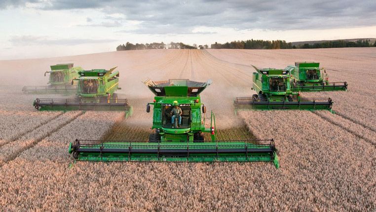
Photos of harvest season tend to depict perfect arrangements of combine harvesters plowing through fields in unison.
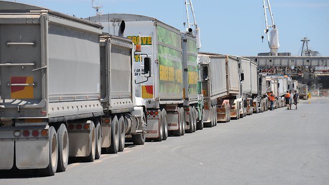
In reality it’s a logistics nightmare of combines, grain carts, semis, and long wait-times at grain elevators. All orchestrated by walkie-talkie.
The problem farmers face is knowing where all their vehicles are and which grain elevators are busy.
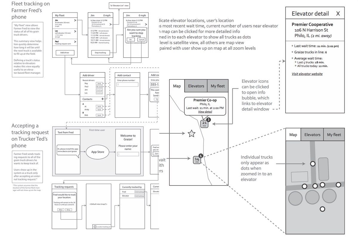
To solve this problem we built an app, a database of grain elevator locations, and a wait-time algorithm. With an iPhone or Android device in every vehicle we could provide farmers with real-time location information and crowdsourced wait-times at elevators.
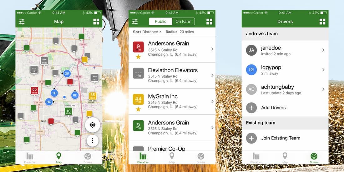
Considering the stressful nature of harvest season, we designed an incredibly simple experience. The map shows nearby elevators colored and sorted using wait times. The Drivers tab lets you build your team by pairing with other users.
We met with customers throughout the development process to ensure we were focused on the right problems and got to test the app by riding along with customers in the cabs of semis and combines. The team I was on received an internal innovation award for the project for its unique infrastructure and simple design.
Mobile Standards
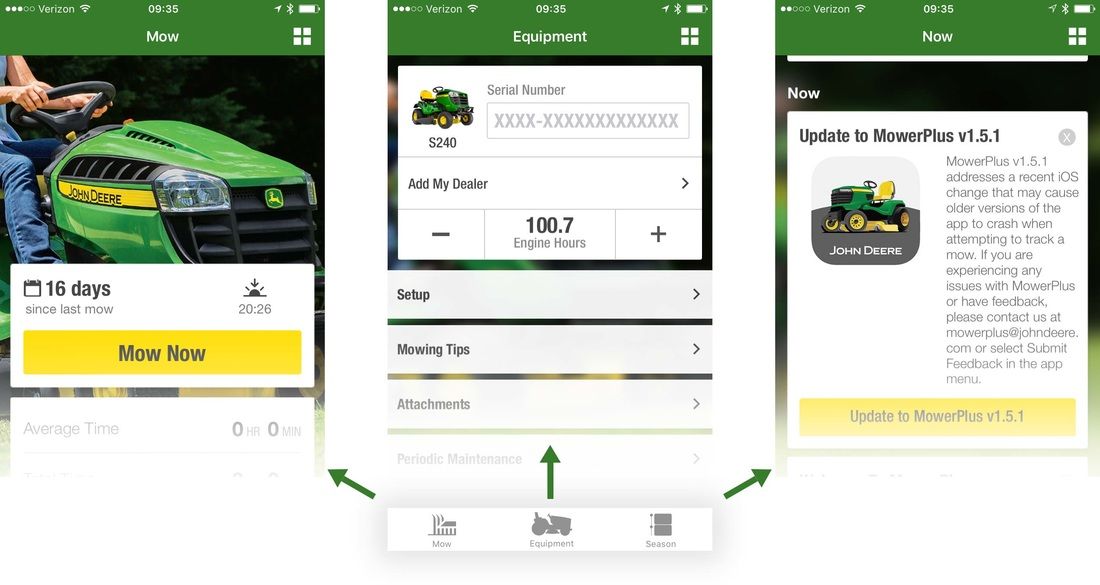
Before the modern “design system” moniker, I helped designed the design standards for John Deere mobile apps.
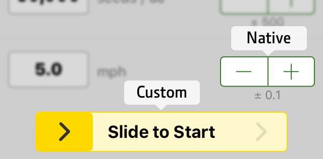
This covered elements like colors, controls, when to use default controls and when to deviate.

I illustrated several app icons (outlined in green) and maintained the guidelines for a growing collection of App Store icons.